I've alluded to the element of detail in previous screenwriting posts, but they're as vital a storytelling tool as they come. Because film is a visual medium, your audience will be affected by the choices you make, even on the smallest scale.
CHARACTER "BITS"
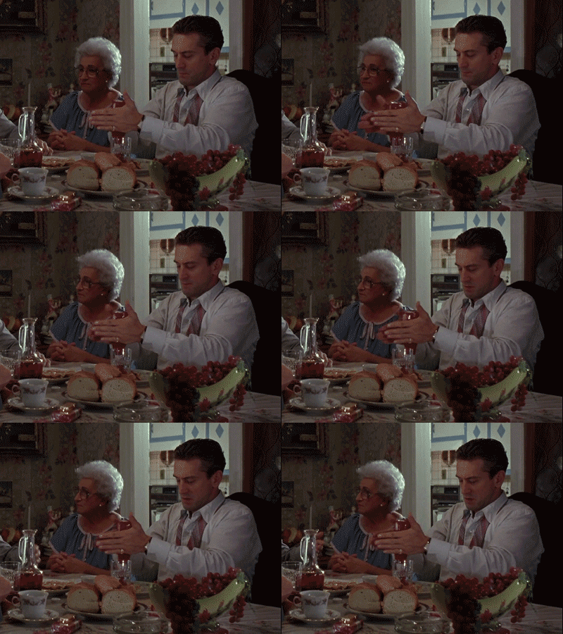
Similar to figuring out a character you're playing as actor, screenwriting demands the same in characters you're creating (or adapting), to move them beyond the archetypes they initially represent. How do they dress? How do they tie their tie? What style of suits do they wear? How do they dress for work? Do they focus on function over flair? How do they handle everyday objects?
For example.
What "tics" do they have in dealing with other characters in their everyday lives? Again, as I've stated in the past, this will show your audience that a great deal of love and effort was put into your story.
REGIONAL TOUCHES
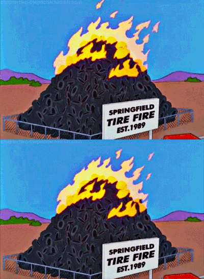
Not to repeat an old point, but regionalism is an easy and effective way to "color" your world-building beyond the bland "city" and "small town" settings. What makes your setting unique? What makes it the best place to set your story? How does it inform your characters' dispositions, everyday lives, etc.? Landmarks, highways, skylines, population, local issues, and other real elements can be a real breath of fresh air to your series of events.
Er, no pun intended.
Regional humor is also a plus, though it's usually best to keep it to asides and not execute it in a way that will leave the rest of the world scratching their heads.
SOUNDS AND MUSIC
This isn't just soundtrack, and will also help to distinguish your setting and mood. Whether it be the train whistle heard in the distance of the South End, or radio station sign-ons and sign-offs, this will give personality to an element often ignored in films.
YMMV on whether this counts.
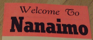
FONTSBelieve it or not, fonts are more indicative of time and era than you would think. Technology, trends, "wanting something new" all play a part in a font's appearance and prevalence. In my own projects, I've noticed that fonts can show a subtle but noticeable difference between a modern-set work and a modern-set one trying to evoke the past. Also, old fonts and signage could signal a business that perhaps hasn't changed its "retro" or "rustic" decor in ages. A few examples of interesting fonts are below.
ARCHITECTURE
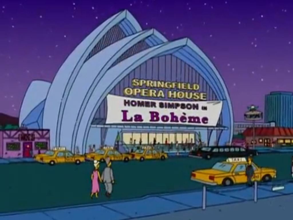
Similar to the two previous headings, what era of buildings do you want your script to see? Do you want to keep to the older, historically-registered sites, or portray a sleek, eco-friendly modernity with the newest ones? Are they shiny and new, or weather-worn and dirty? Are they in line with your story's themes, or a contrast to them entirely?
On an unrelated note, Springfield has an awful lot of opera houses.
WHAT'S IN THEIR ROOMS?
How obscure are your characters' interests? If they're into Canadian literature, you shouldn't just stick to Atwood, Richler, and Cohen, but also authors such as Shanon Sinn and Harold "Sonny" Ladoo. If your character is a hockey fan, don't just go for Gretzky and Orr, but also go for Eddie Shack and Stan Mikita. Since audiences know what "classics" have become "boring" choices for these characters' archetypes, choosing the more obscure will in turn show your characters' dedication to their interests and how much they're willing to show it in their "sanctuaries".
I've had to remind myself that Jigsaw Jane is not an actual film,
as much as Suzanne Pleshette would have been great in a film like that.
Nowadays, I've noticed many works moving away from the 1:85.1 aspect ratio and going more towards the anamorphic camp. While it certainly is a matter of personal preference, closed, claustrophobic stories seem to benefit from the 1.85:1 over the 2.35:1, which I find is often better suited for films showcasing settings and landscapes.
Hyped as "The first big murder mystery in CinemaScope!",
Black Widow's compositions and lighting can either throw off
the viewer, or add to their sense of unease through the element of contrast.
The more intimate camerawork in The Bad News Bears helps the viewer
acquaint themselves with the emotions and tensions of the baseball field
in a visual (and often confrontational) way.
Again, this will ride on what themes and closeness to the emotion you want to emphasize in your story. Know what a given framing is traditionally used for, so you can follow or subvert it. This will also have the added effect of influencing how you want to emphasize certain details.
Galaxy Quest expands its aspect ratio from 1.85:1 to 2.35:1
when the vista of the planet Thermia is revealed to Jason Nesmith.
This list is not exhaustive by any means, but hopefully I've gotten you to think about all the choices you choose to visualize, and how not a single facet should be anything short of deliberate.
And that includes racing stripes and fins on a nuclear power plant.
Copyright © Chynna Moore


No comments:
Post a Comment