

Needless to say, some fonts have lost their novelty
in the ensuing decades.
With so many subtle touches afforded by the right font, it can help you narrow down the way you see and "market" your stories. Are you going for vintage? Classic? Futuristic? Or a mix of others?
If you lean towards the past like this writer (or need some fresh inspiration for your other designs), here are a few pointers in finding fonts that will stand out among the other, more generic fonts.
SEE AS MANY ADS, TEXTS, AND PRINTINGS AS POSSIBLE
Part of an ad agency's job is to match the right typeface with their clients and their products. What feeling do you want to evoke with a font? What products and companies strive to evoke that same emotion through their advertising? See these posters below.


Notice the earlier, more whimsical design and font on the left, compared to the more subdued version from 1980 (right). DQ's Dennis the Menace branding proved abundantly successful in its day, but it's also clear to see how DQ also used more "adult" advertising at the time to appeal to parents taking their children for a Hot Eat or Cool Treat. (Truth be told, one does not feel old until they remember seeing their local DQ's "Brazier Foods" sign as a child.)
In viewing vintage ads, posters, news clippings, and whatnot, it's also surprising to see how many fonts have long since been forgotten from their heydays.


Technological factors especially figure when it comes to newsprint.
Again, your story and what you want to visually represent will influence your choice of fonts. When it comes to what a company or franchise represents in culture, if you want to evoke an All-American, nostalgic feel, you can't go wrong going for the visual aesthetics of burger joints, diners, etc.
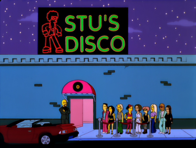
Or you might want to evoke a nautical, late-70s touch that takes your viewers back to that time.

Start from your script's inspirations and work from there. Does your real-life setting have an old ad for its opening? Do you want to emulate a then-generic, comparatively-mundane news listing? Even the most insignificant postcard, headline, or piece of decor can find its way to the internet eventually.

Even this ad from 2020 evokes the more cursive fonts of yesteryear.
MAKE YOUR FONTS WORK FOR YOU
An old point, but to reiterate: "Connect" your details, whether they're following your themes or subverting them. Is a chosen font meant to be part of a run-down sign? Is it spiffy and new in a period piece? Is it part of a long-running business with a foot in the past and one in the present? Fonts are a vital piece of your settings, and help said settings become another character in your script.

Classy, but not ornate, and slanted to emphasize quicker service.

Crisp, clean, modern, and indeed "fresh".

Urgent, bold, and not far off from an old warning sign.
Do you agree with each font's assessment above? Disagree? Or do you want to put your own spin on it? In any case, you're thinking about what a font means to you already.
AND OF COURSE, HAVE FUN
If you're just letting your brain relax after a hard day, doing the above is also a good excuse to check out your favorite movies, T.V. shows, posters, etc. and see how they've been presented to the world throughout the decades. Notice how some works get "updated" with different fonts throughout various home video releases.


Many early DVD releases spent little effort on packaging design for the then-fledgling format.
Most Blu-ray releases, however, with better technology and seemingly a need to justify its higher price and quality,
worked harder to replicate the art styles and typefaces that made these films' initial releases memorable.
Or how throughout the decades, the same product's fonts have become iconic in and of themselves.


To choose your fonts isn't to make your story more "marketable", but rather to "market" your story to your own advantage.
Sometimes, the "marketing" really does just write itself.
Copyright © Chynna Moore
No comments:
Post a Comment